
Imagine that we can plot a tantrum on a graph…
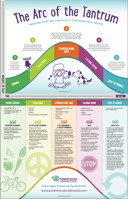 The “y-axis” is “level of tantrum” and the “x-axis” is “time.” The tantrum shape is a bell curve, divided into stages. The first stage: there’s no tantrum, but then there’s some sort of trigger, after which behavior begins to worsen. It escalates to its worst level (dysregulation zone) and after time begins to reduce, eventually coming back to ‘zero.’
The place where parents are most motivated to intervene in their child’s behavior?
That top (orange) area.
The place where interventions are LEAST likely to do any good?
Also that top (orange) area. (Aha.)
Flip the illustration over (or look at the bottom half) and you’ll see the bell curve shape reproduced, with 5 differently colored columns. These columns coordinate with the stages of the tantrum, and include advice on best techniques for managing behaviors during that phase.
Parents, this is a cheat-sheet! A short-cut to understanding and better responding to behavior. Use this to pick effective interventions based on your child’s brain functioning at any given moment.
To say it another way–this helps make sense of your child’s tantrums, explains why some things you do just make things worse, and gives a parent guidance for what TO do instead.
This is the concept that parents, over and over, have told me has been most helpful for them, in understanding and managing behavior. Download the easier-to-read pdf (English version) updated 2024 here.
(PS. “Tantrums” aren’t just for toddlers! Teenagers and you and me–we all have a version of tantrums, too!)
Want more? There are lots of resources for parents on this website related to the concept “The Arc of the Tantrum.” Here’s a list:
I’M SO EXCITED TO HAVE THE ARC TRANSLATED INTO MANY MORE LANGUAGES!
- Spanish Translation of The Arc of the Tantrum (click link for .pdf format)
- German Translation of the Arc of the Tantrum
- French Translation of The Arc of the Tantrum
- Hungarian Translation of The Arc of the Tantrum
- Indonesian Translation of The Arc of the Tantrum
- By the way, if you are fluent in another language and would like to see this infographic in your language, contact me. We might be able to make it happen.
- The **Webinar**! The webinar gives you a chance to hear these concepts explained more thoroughly, with more examples and details that make it easier to understand and implement. Our brains typically need to interact with information more than however long you spend on this page to be able to use that information. Give yourself the gift of more support! Join us live or watch the replay anytime.
- The Class. 6 hours of LIVE information and support from me! This class is TRANSFORMATIVE! Check it out.
- The Arc of the Tantrum 3 minute sampler video
- “Are you going to let her get away with that?” blog post
- The Kids who Need the Most Love will ask for it in the most Unloving Ways